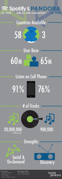
The infographic itself
The moment you have all been waiting for… well, at least I would like to think you have been waiting for it. My completed infographic comparing Spotify and Pandora.
Why?
This infographic was an assignment to practice showing data in an interesting way. We could choose any topic that we liked. Since I love music (I am listening to The XX right now), I decided to do my infographic comparing the two big music streaming services, Spotify and Pandora.
Problems
I did run into a few hitches. I had sent out a survey to a few hundred people to get some data back. I made my survey very general so as to not indicate any bias I have towards Spotify. This meant that I had several options for them to choose from when answering what their favorite services. When my results came in, I had lots of data, but only a small percentage of that information I could use in making an infographic specifically on Spotify and Pandora.
I was able to gather other information from the library database on privately held companies to be able to put together something useful.
The How
I love Illustrator, let me tell you! Using Adobe Illustrator made this project so much easier than doing it in any other program including Photoshop. I had complete control over the stroke and the fill of my shapes, and it has great tools like rotate, and reflect that came in handy when making the background texture.
Vectors
I made almost all of the images myself. I took the Spotify logo, and name as well as the Pandora logo from others, but all of the other vectors I made myself. I cite where my data and images come from at the bottom of the infographic.
Pre-finale
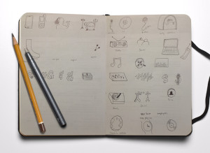
Here are some of the steps I took in making the infographic.
Click here to check out the Pinterest board where I got my inspiration and where I posted my infographic.


