The Pomade Story
It was December of 2014 when I decided to get a Macklemoresque hairstyle. You know, the super short hair on the sides, and the relatively long hair on the top.

This is when I learned that you need something called pomade to sport this kind of hairstyle. Pomade is a cross between hair-wax and gel. This makes the hair slick nicely to the side, or to the back while not giving too much of a greasy look to it.
The Assignment
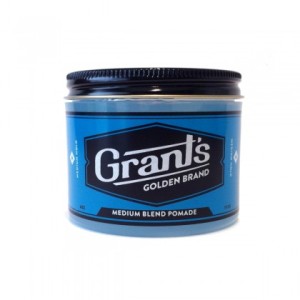
The assignment was to take a package design that was less than stellar and improve upon it in some way that would increase sales for the company. Grant’s Golden Brand Pomade make a great pomade, but their package design is less than conducive to the classic old-era look that their company strives for.
Take their current package…
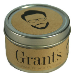
The logo isn’t too bad, but I just don’t understand the reason they made the rest of the package a vibrant blue color. Their own website states that they, “merge today’s sophisticated technology with the aesthetics of the gentlemen of the bygone era.” The bright blue plastic can doesn’t do this for me. I decided to throwback the package to a tin can (only costs $0.65 in bulk), and make the label out of a brown textured paper.
This solves a few different issues. Grant’s also does not try to target any specific segment of the market, they hope that by making their product available to all, they will be able to sell significantly to all. The new package will appeal to a hipster-like segment and live up to the company’s desire to be aesthetically pleasing to the bygone era.
The new design…
Challenges
Every project comes with challenges. The first of a few challenges was to actually obtain the cans that the package would go on. No where in the little town that I live in had the right size and shape of can that I really wanted. These had to be ordered online (Amazon has everything!). Next the paper that I really wanted the label printed on was eaten by the print shop that I went to. They had a close alternative that I ended up going with. The last big issue was getting the top and bottom label to be cut in a perfect circle and centered. I ended up just trying over and over until I got some that looked right.
The steps
Redesign the logo…
Make a cool vector of a Grant’s persona…

Wanna buy this vector? Click the button below
Download Vector
Make an ad targeting who would likely buy the product…

https://youtube.com/watch?v=1wmF1R2CynE
Style Guide
Check out the whole style guide below to see how the redesigned label is to be implemented.
[scribd id=259411267 key=key-OnaqKAM6i1HkKWiByAGM mode=scroll]
Images from:
Macklemore – www.rapbasement.com/macklemore
Grant’s – www.themotley.com/grant-s-pomade
Vector inspiration – www.inspirationluv.com/20-mens-hipster-hairstyles
Man in Ad – hairstyleonpoint.com/6-amazing-hairstyle-inspirations


