New Material Design
Isn’t design awesome? Good design can make a poor product feel high quality, and bad design makes what would be a great product seem…lackluster. Here’s a sneak peak at Chrome’s new material design and instructions for turning on Chrome’s material design on your computer.

The Nitty-Gritty Details
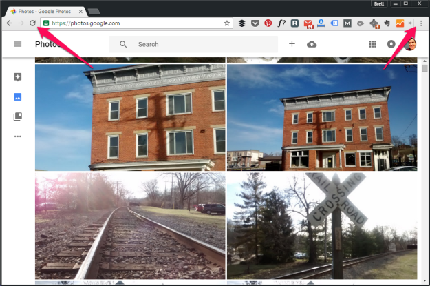
On the left you will see the old design, the right shows the new design.


Navigation buttons have a thinner stroke, and overall a sharper shape. The webpage security lock also got an upgrade. This new design overrode the theme color that I had selected making the gray behind the tab less dark.


A quick look shows the biggest difference is the new ‘Menu’ button is now three vertical dots, dropping the three vertical lines we came to know and love. It seems the ‘more extensions’ button is ever so slightly larger, and the vertical rule between this button and the new ‘Menu’ button is more defined.
Instructions for Grabbing the Material Design
So, do you want to turn on Chrome’s new material design?
Follow these steps:
- In the “Omnibox” (this is Chrome’s equivalent of the URL bar) type in chrome://flags
- About 1/5th of the way down, you’ll see “Material design in the browser’s top chrome”
- Note: I’m using Windows 10 on a PC with the latest version of Chrome (v. 48.0.2…)
- In the drop-down list, change the selection from ‘Non-material’ to ‘Material’
- Click ‘Relaunch Now’ for the change to take effect
- Voila, you’ve got it.
Don’t have Chrome? Download it here.
Let me know what other details you find Google has included in the new design, and other tricks you know about using Google Chrome by commenting below.
